07The People's Project
Filling everyday needs and empowering communities through mutual aid

about
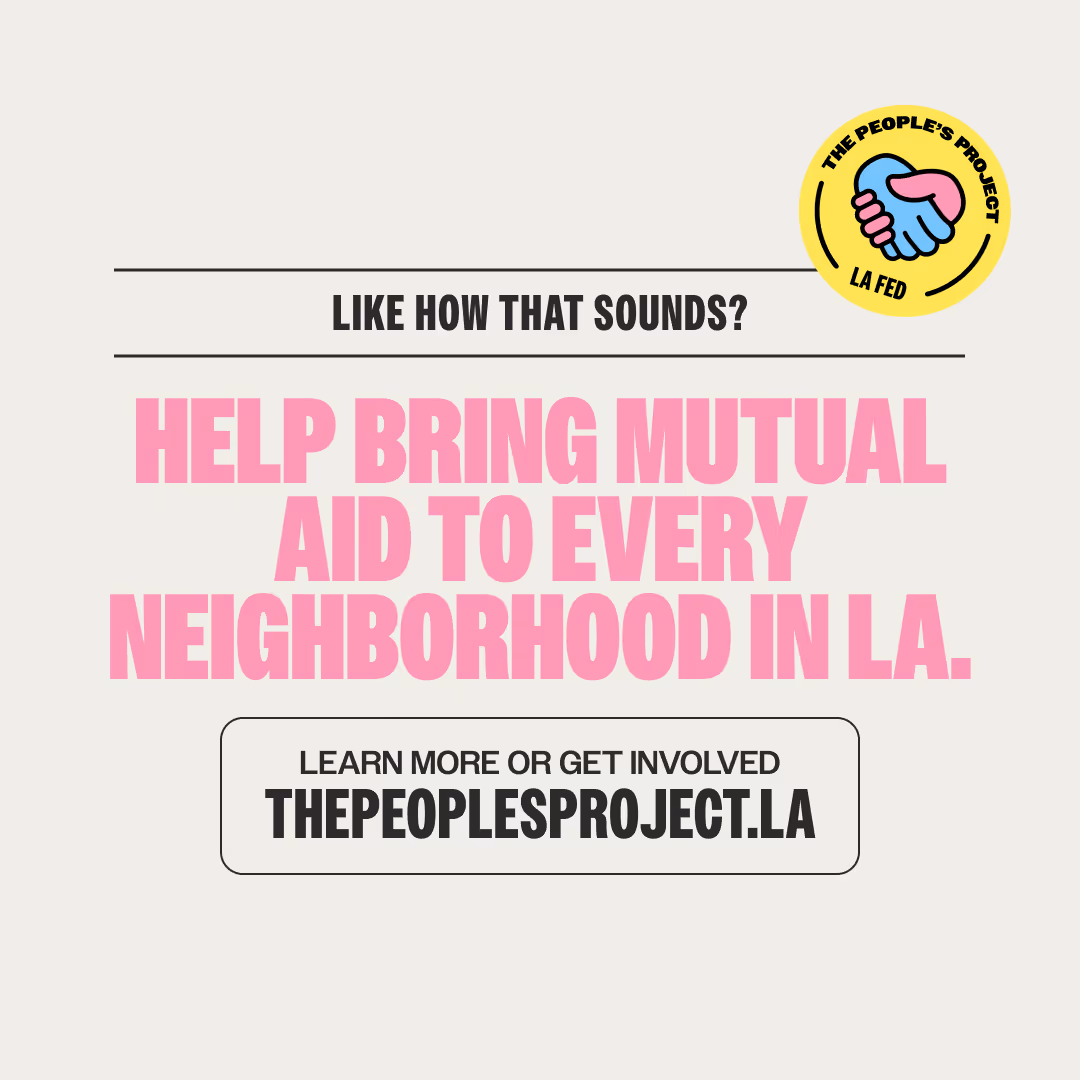
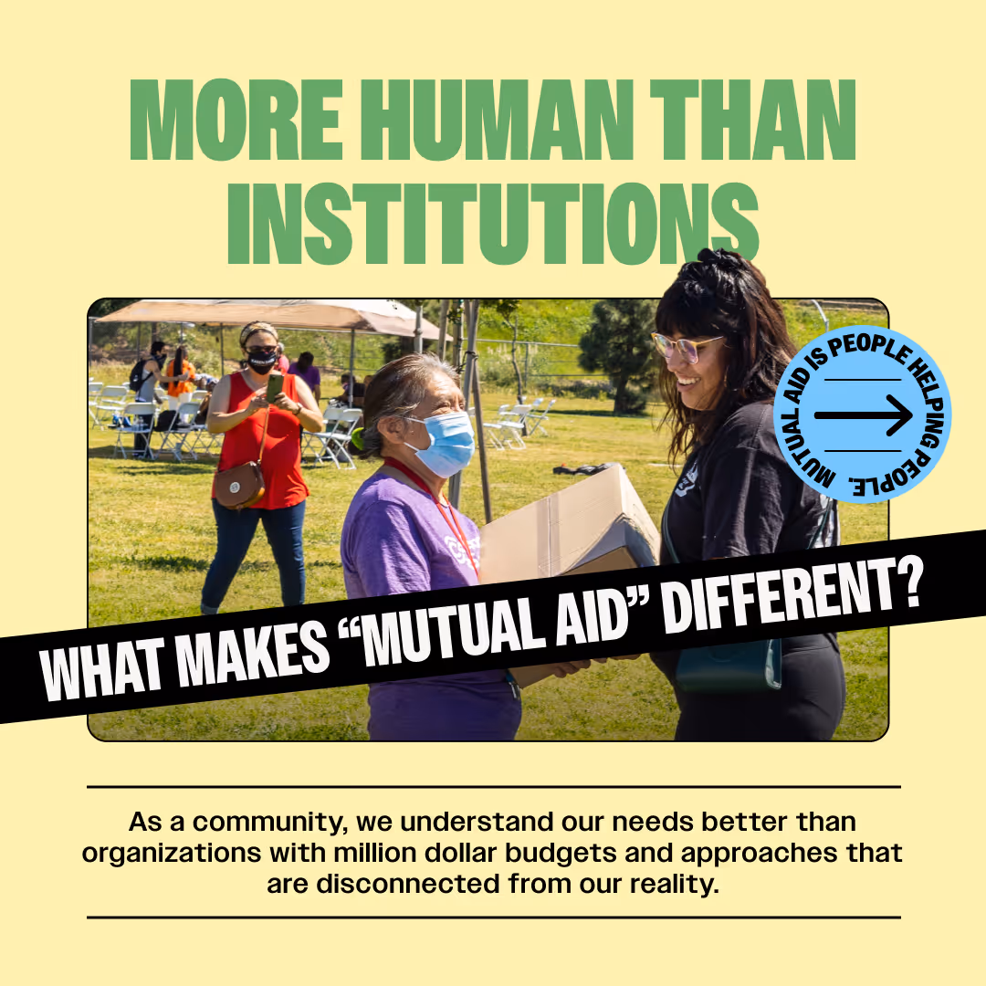
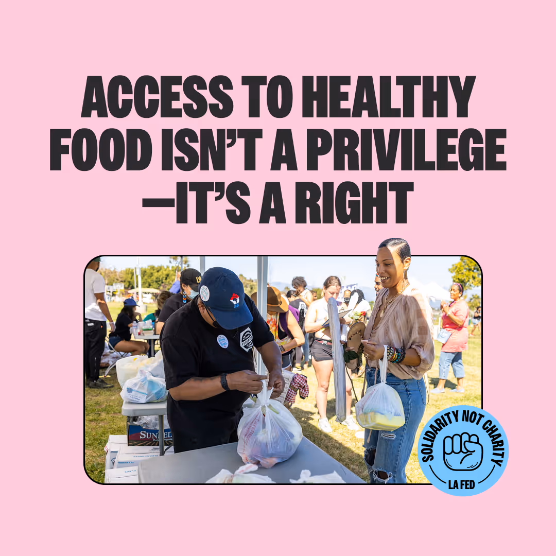
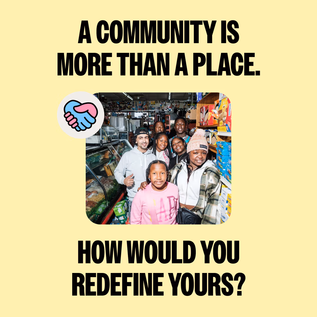
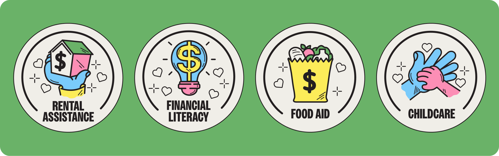
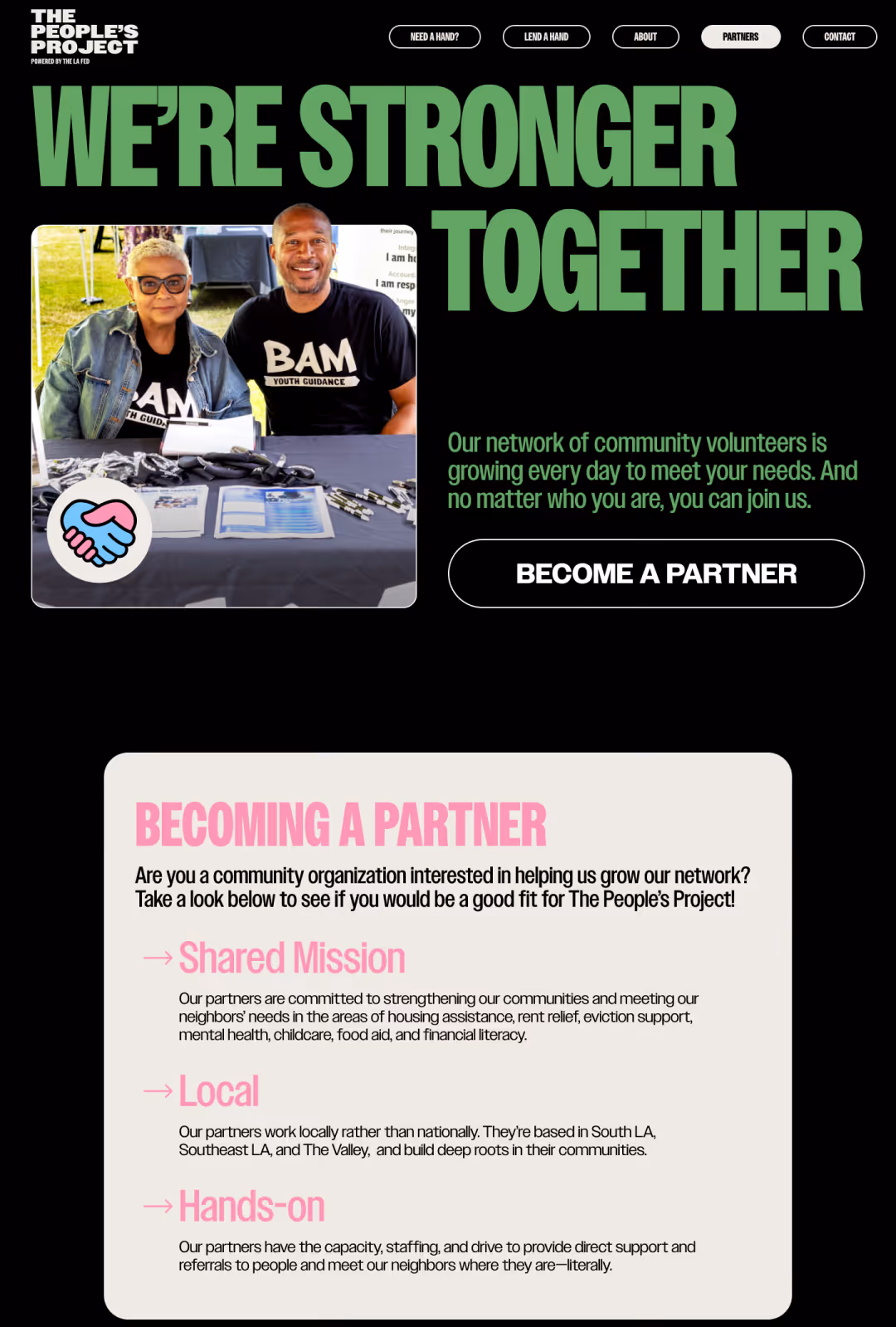
The People’s Project is Los Angeles-grown mutual aid organization working to fill everyday needs and empower communities. It aims to connect communities with rental assistance, food aid, financial literacy, workforce training, childcare and more by facilitating and strengthening the ties between organizers, volunteers, and neighbors. Through solidarity, not charity, the People’s Project is meeting everyday needs, cultivating community bonds, and scaling mutual cooperation in Los Angeles neighborhoods.
01
branding
02
website
03
collateral
01
branding
02
website
03
collateral
01
branding
02
website
03
collateral
01
branding
02
website
03
collateral

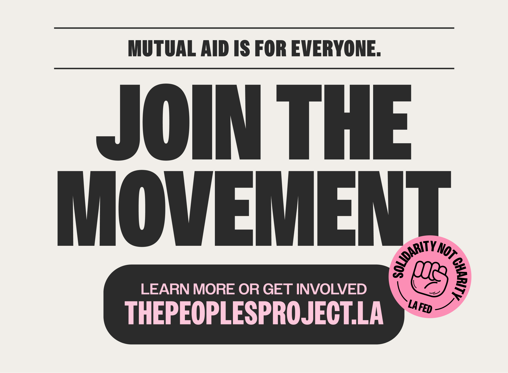
The People’s Project is brave, groundbreaking, and the powerful. The brand my team and I created matches that energy. It is dynamic–its loud and active tone is balanced with playfulness to evoke a homegrown, approachable, yet credible feel.
01branding
The brand is bold, human and approachable, with vibrant colors, striking contrasts, and action-oriented typography. The homegrown aesthetics of mutual aid history are echoed by illustrations and sticker graphics, while the polished photography and modern colors bring the system into the present and strike a more professional tone.

02website

about
The People’s Project is Los Angeles-grown mutual aid organization working to fill everyday needs and empower communities. It aims to connect communities with rental assistance, food aid, financial literacy, workforce training, childcare and more by facilitating and strengthening the ties between organizers, volunteers, and neighbors. Through solidarity, not charity, the People’s Project is meeting everyday needs, cultivating community bonds, and scaling mutual cooperation in Los Angeles neighborhoods.


03social design
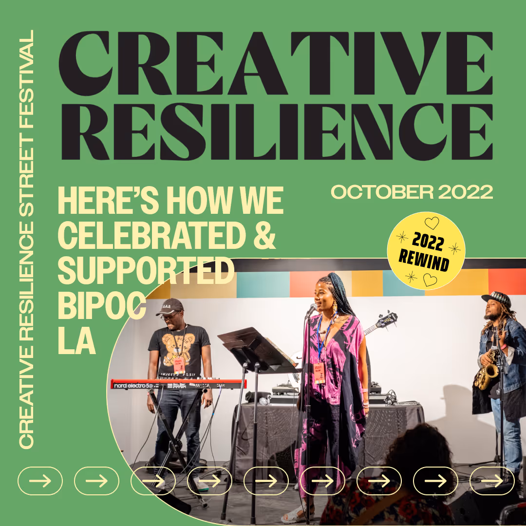
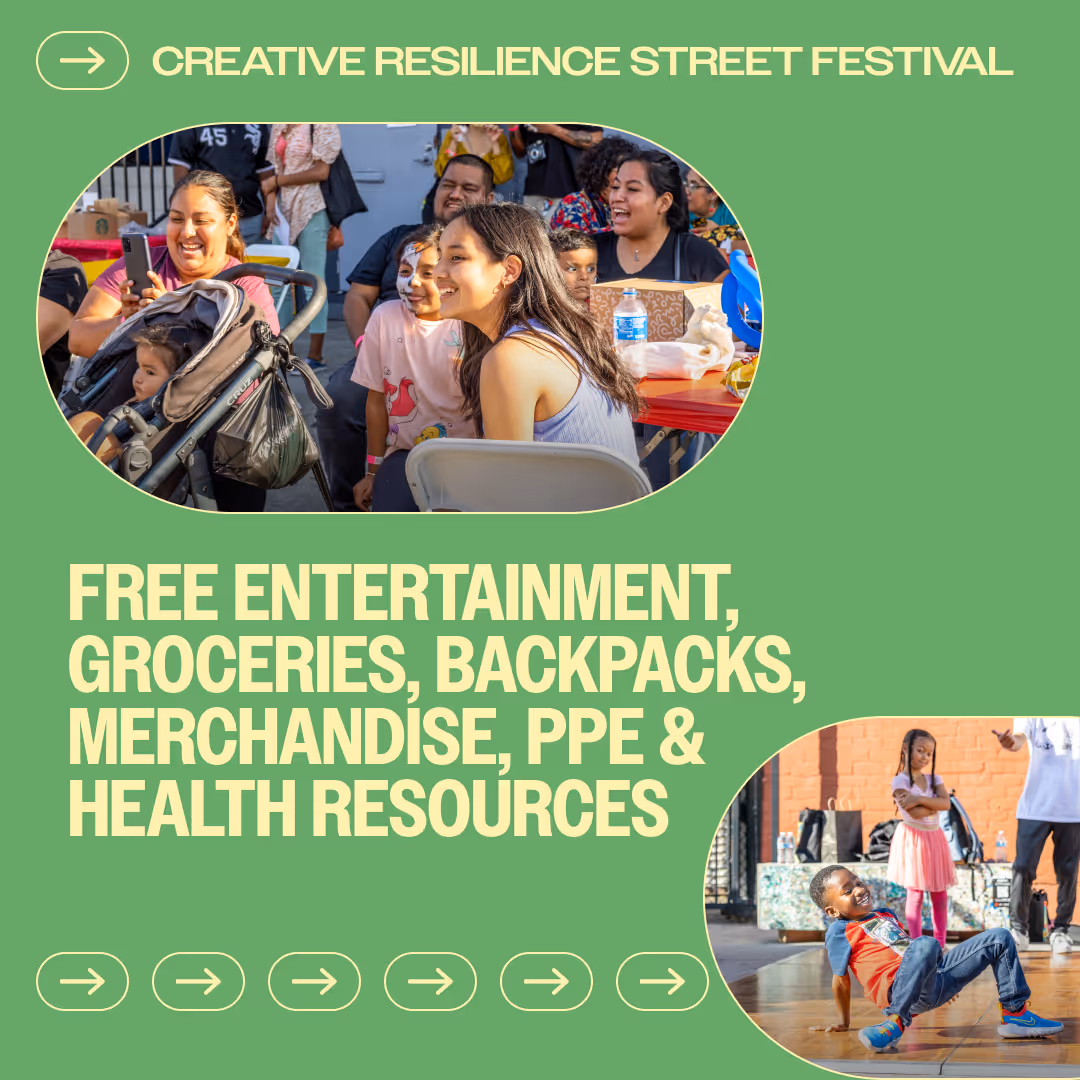
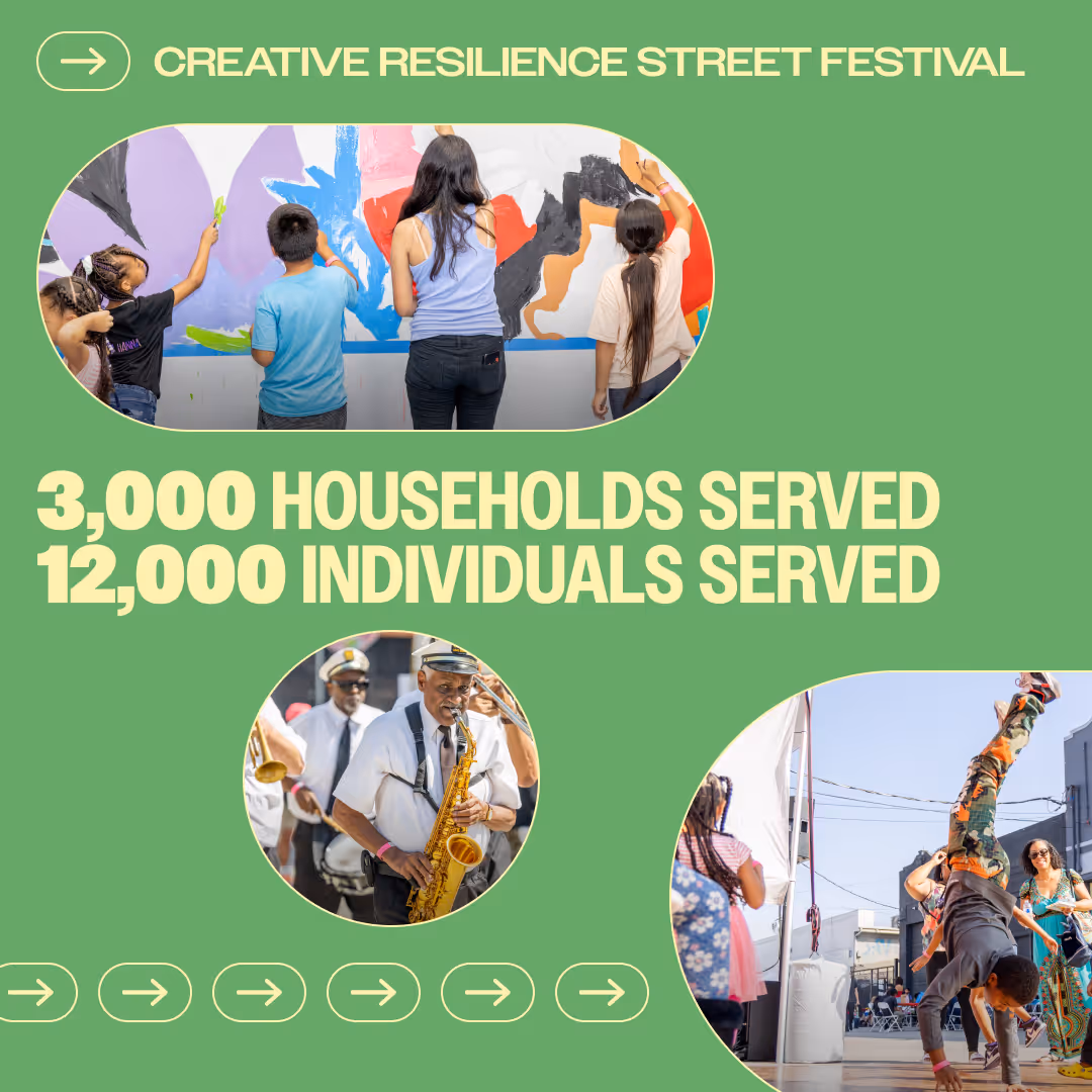
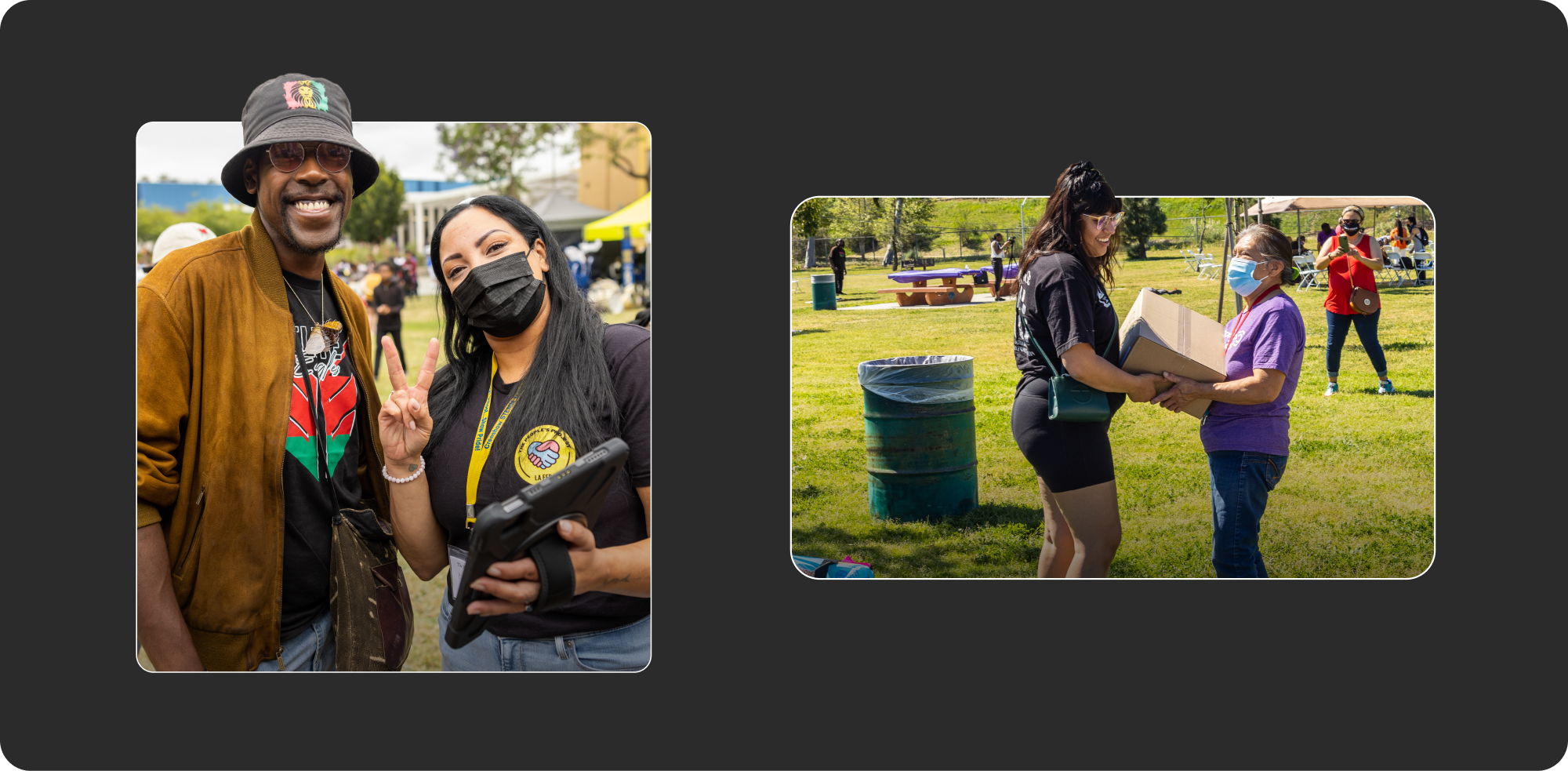
Through social media I was able to flex the brand to its boundaries, mixing refined, simple designs with bold, experimental compositions. We used social posts to inform our audience of partners and events, educate and provoke conversations about mutual aid, and celebrate community connection.