04MNTRA
Designing for a content studio rooted in craft and driven by intention.
about
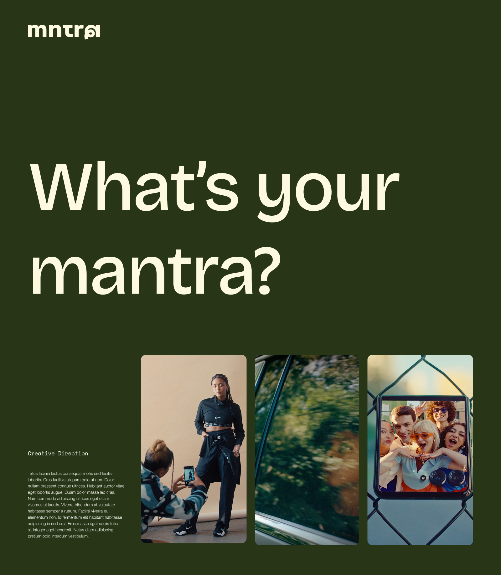
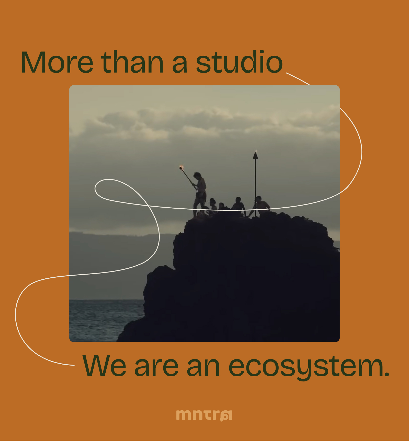
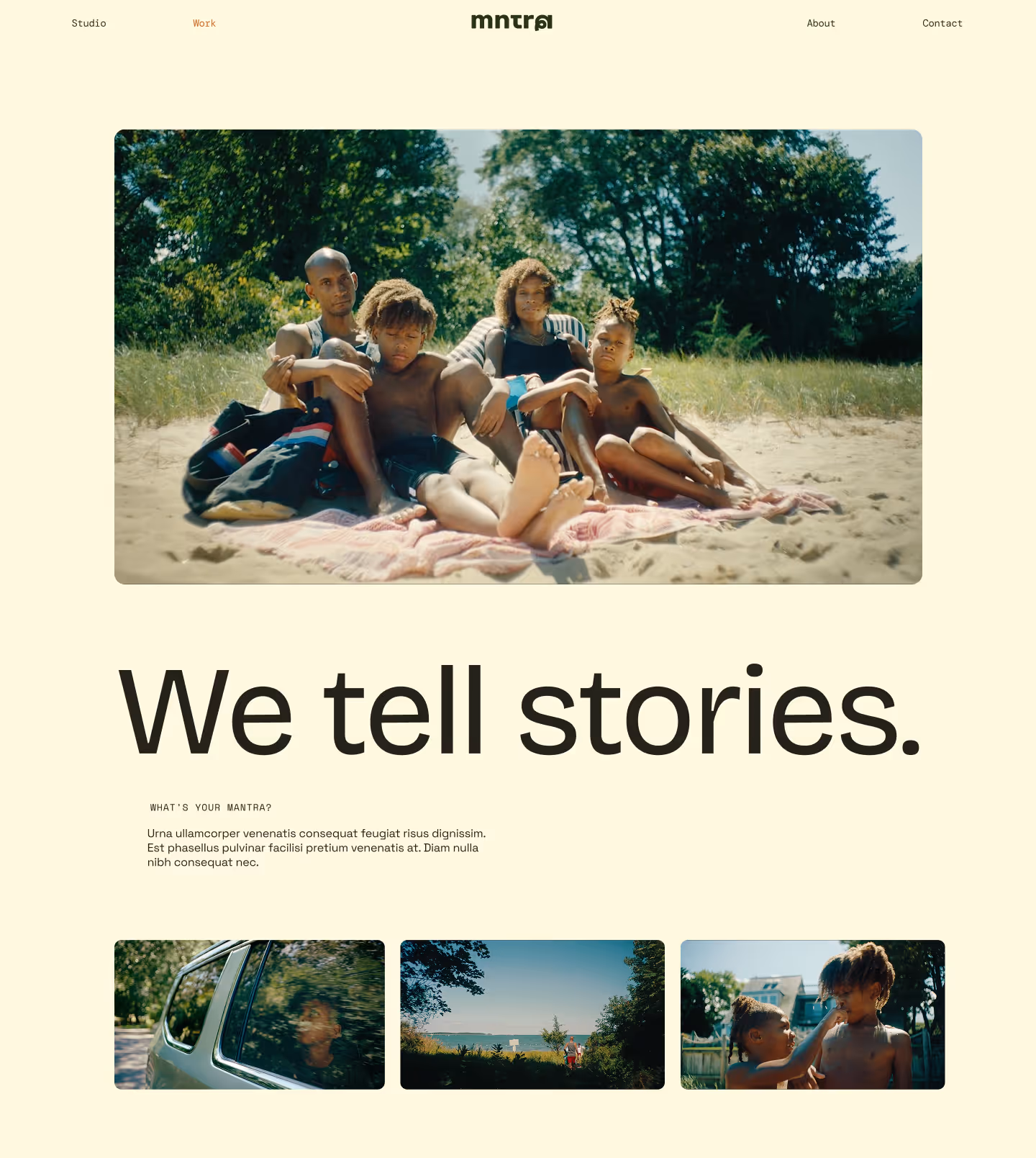
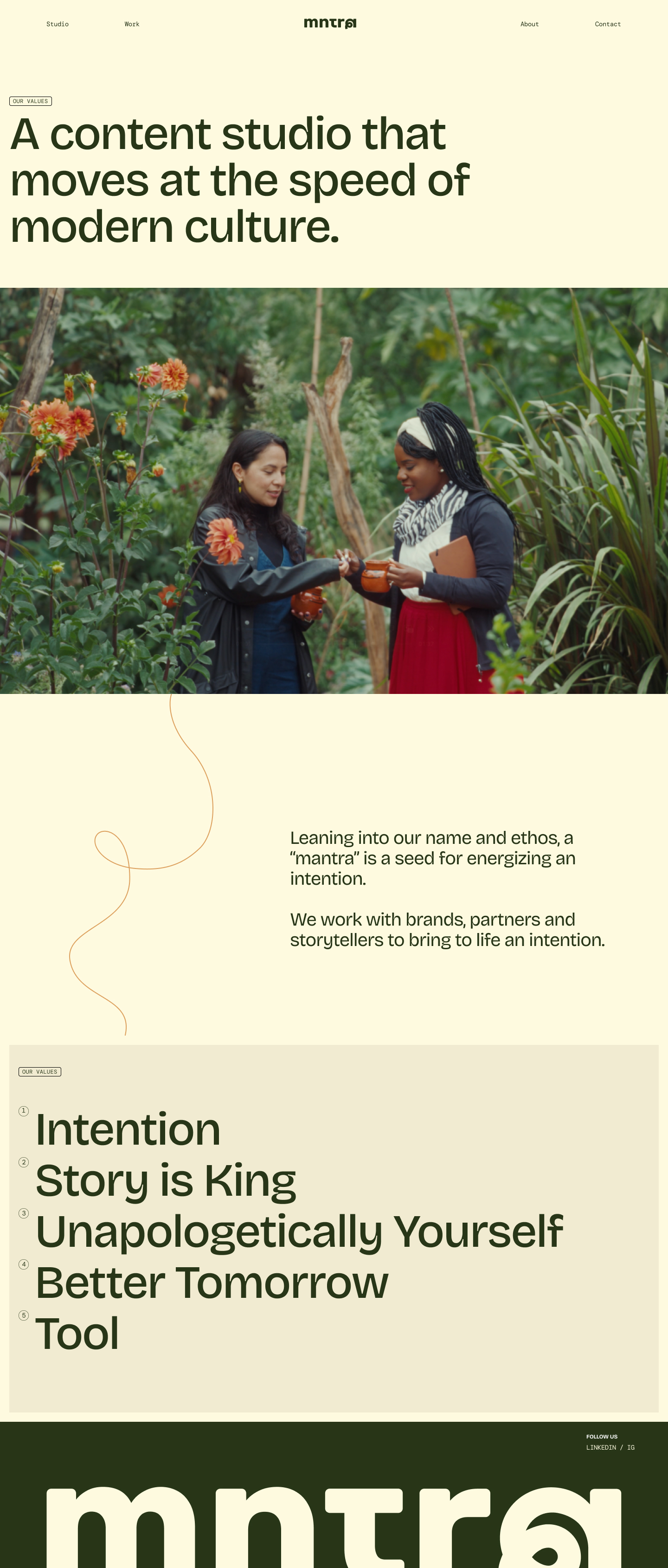
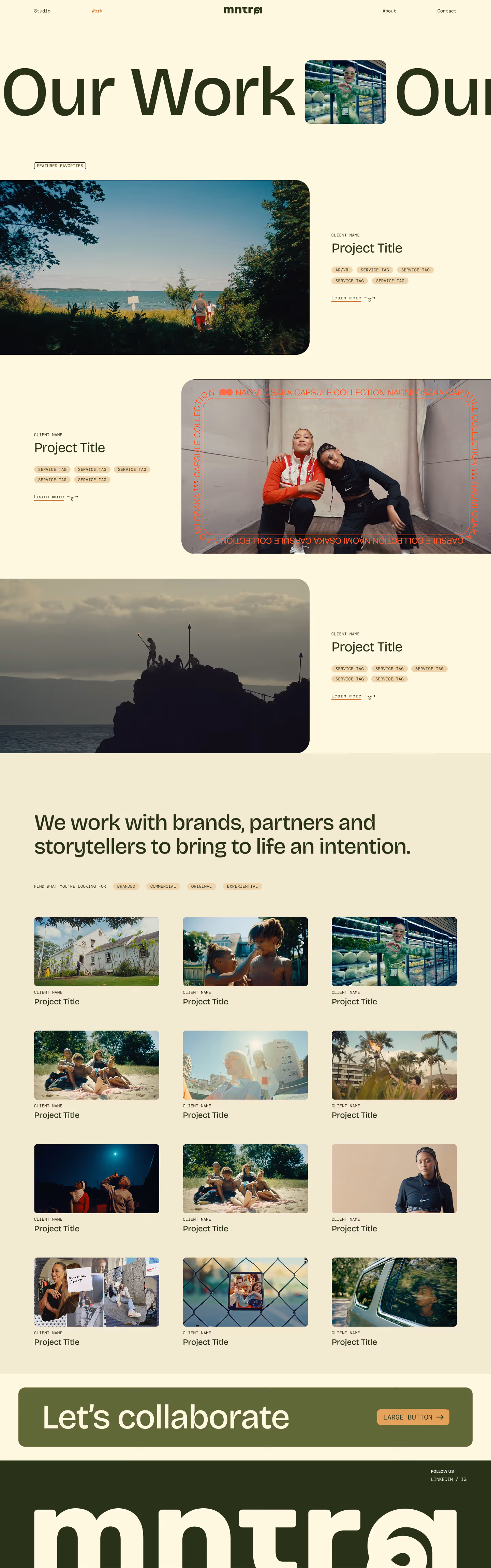
MNTRA is a full-service creative production studio rooted in craft, built on partnership, and driven by intention. They work with brands, partners and storytellers to bring life into big ideas.
01
branding
02
website
03
collateral
01
branding
02
website
03
collateral
01
branding
02
website
03
collateral
01
branding
02
website
03
collateral
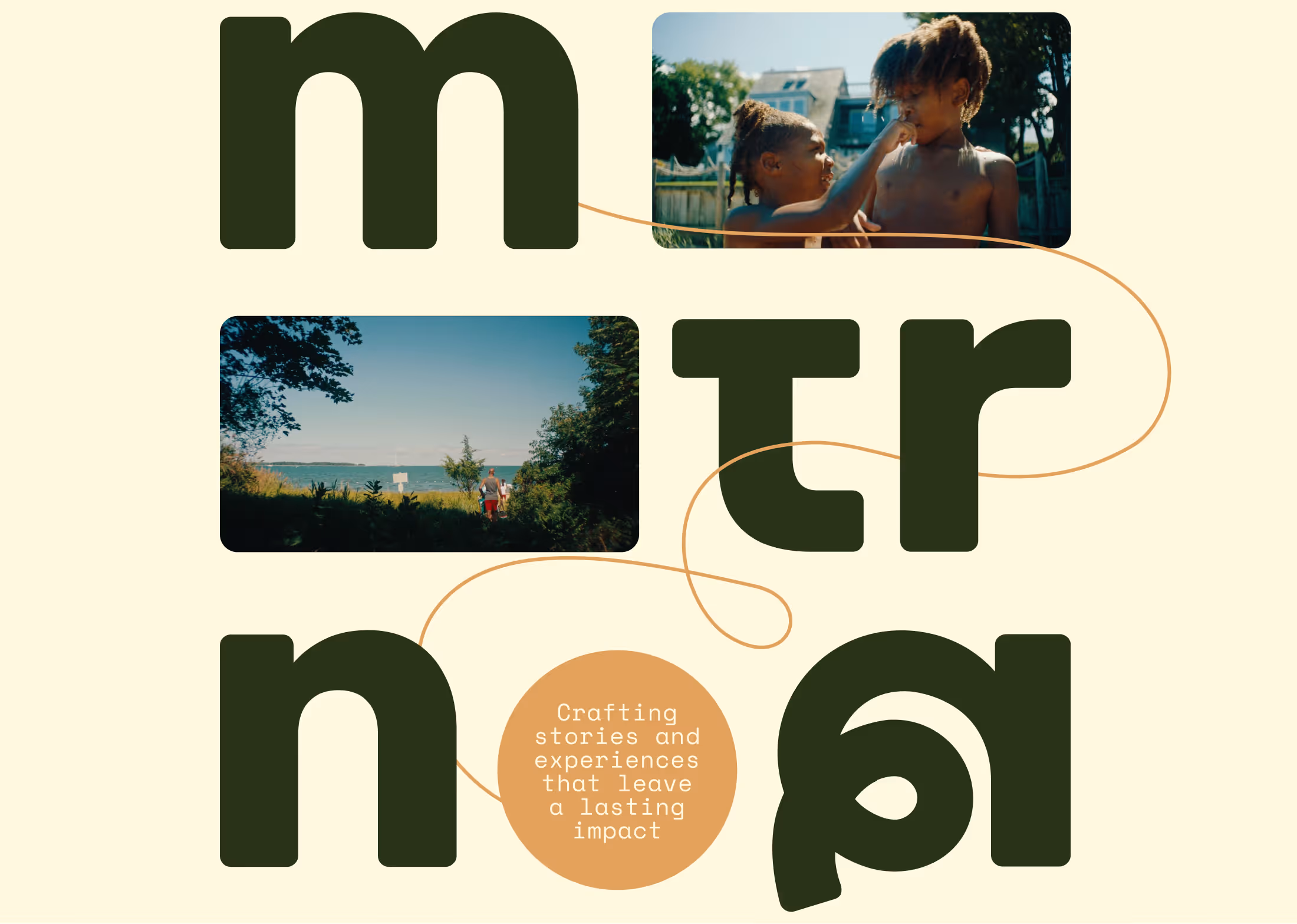
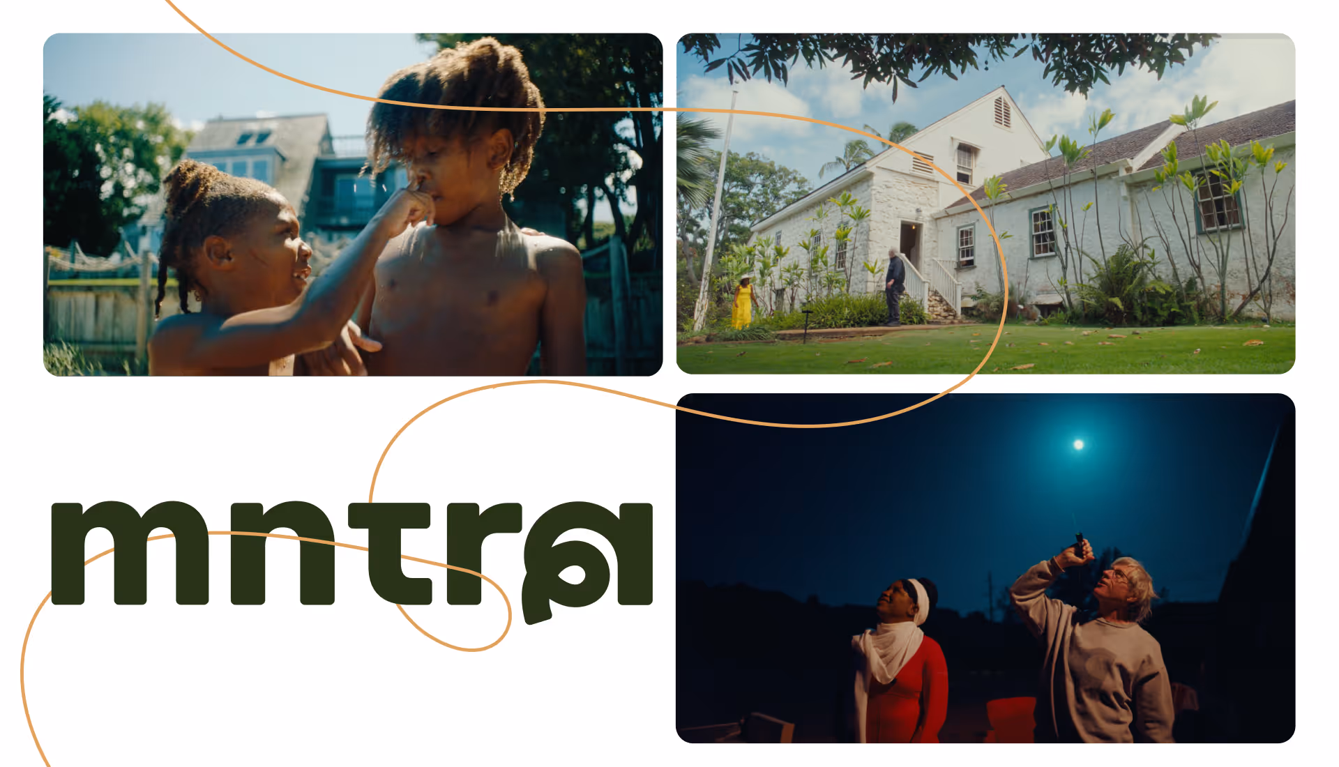
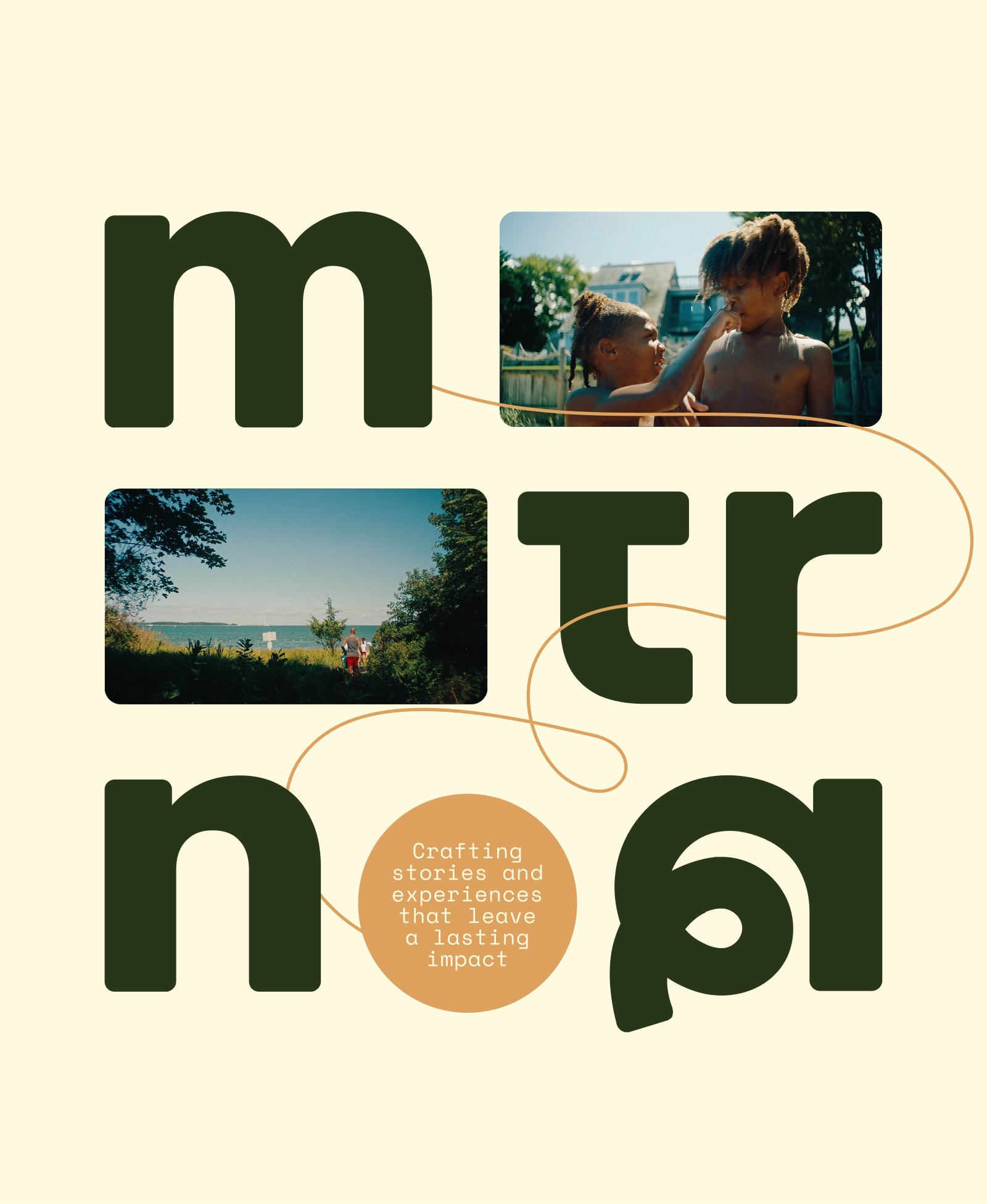
MNTRA's founder sought to create a brand that matched the intentionality and ethos of the budding production company. Beginning with just a logo, we worked together to create a identity that balances dynamicism with calm, and expression with subtlty.
01branding
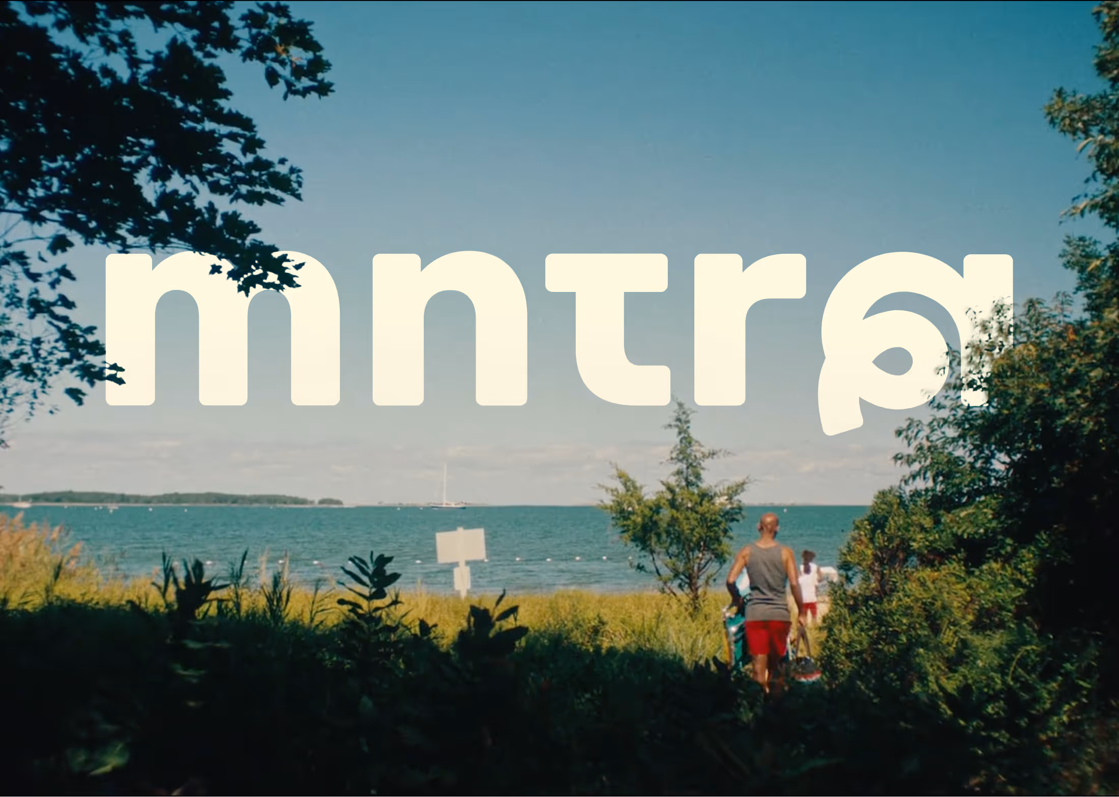
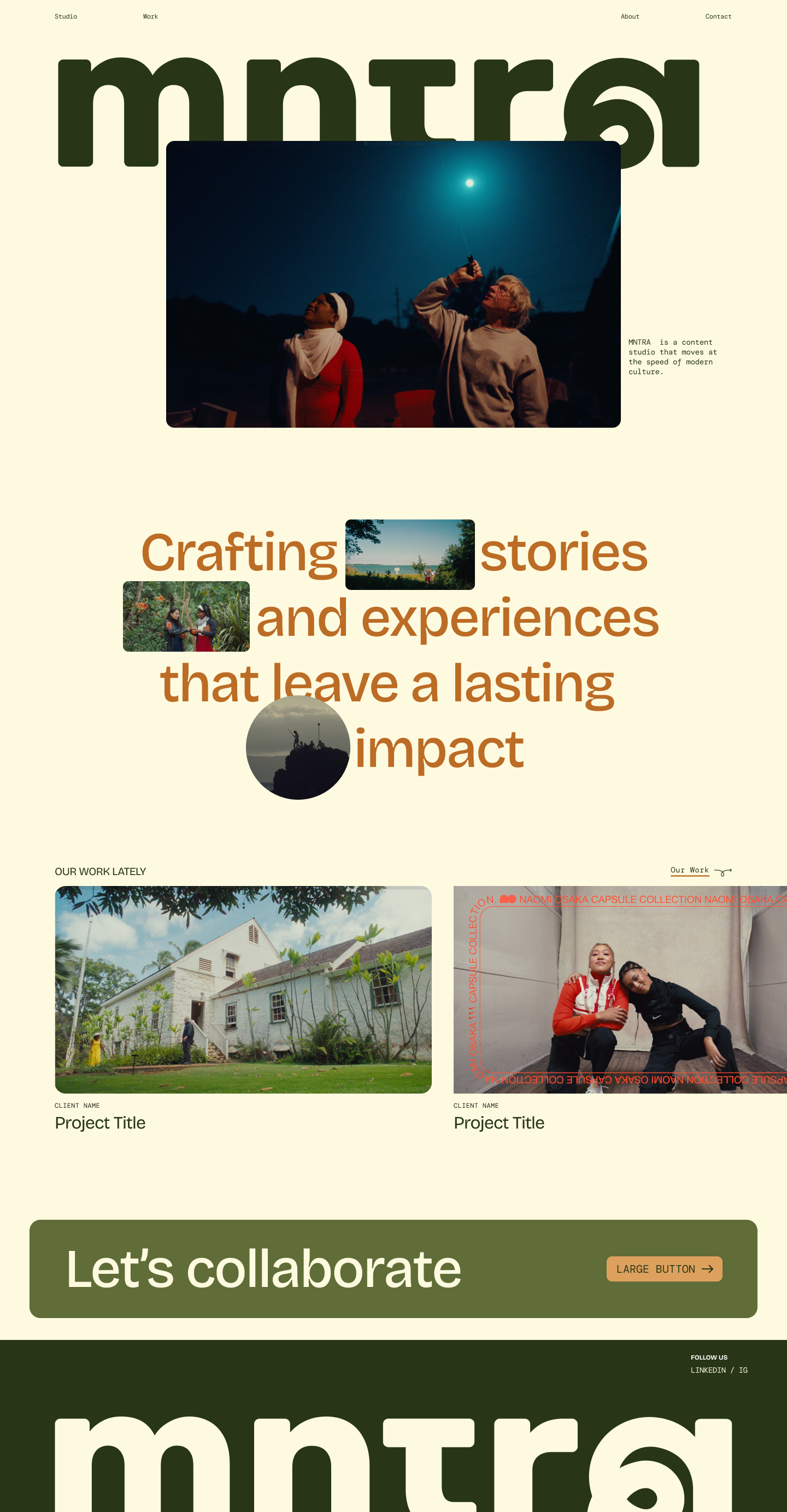
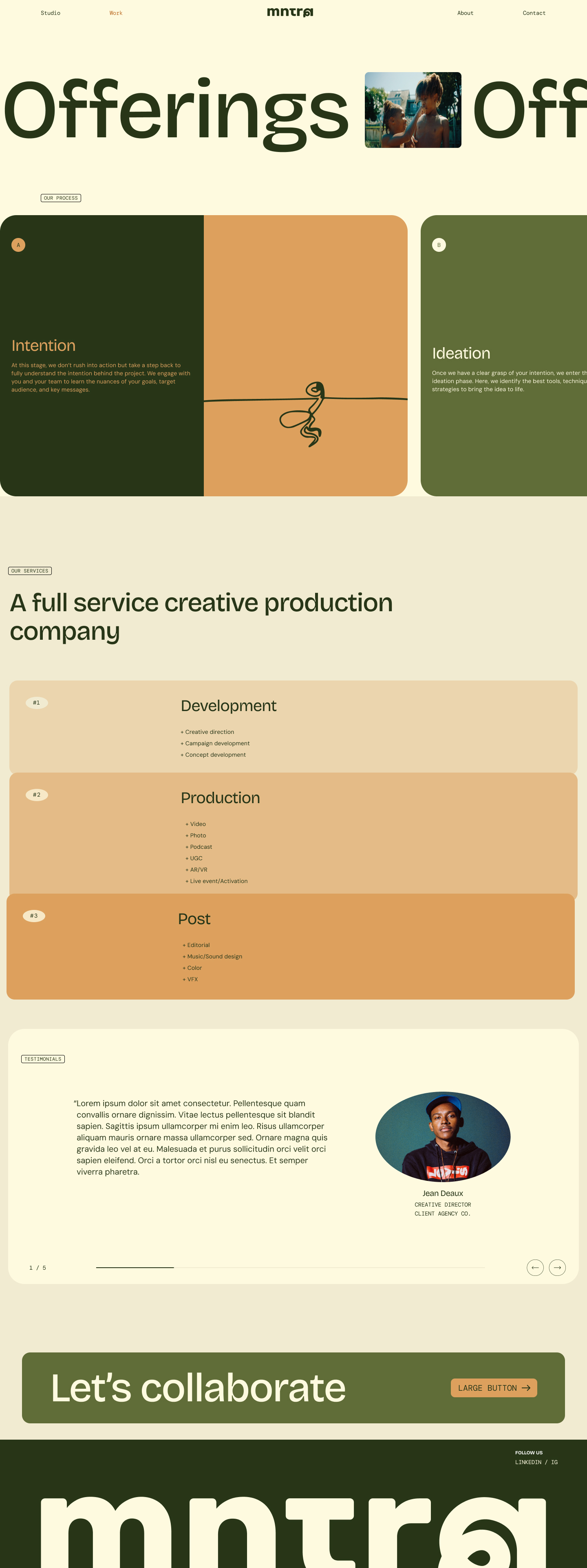
Earthy, calm colors laid against warm neutrals feel grounding and peaceful, while playful elements sparingly applied bring pops of expression. Curling, meandering lines found in buttons and throughout the brand application reference letterforms in the logo and echo the motif of nature and growth. This theme is reinforced again in the typography, with the primary font's deep ink traps that give the letter forms more organic shapes.
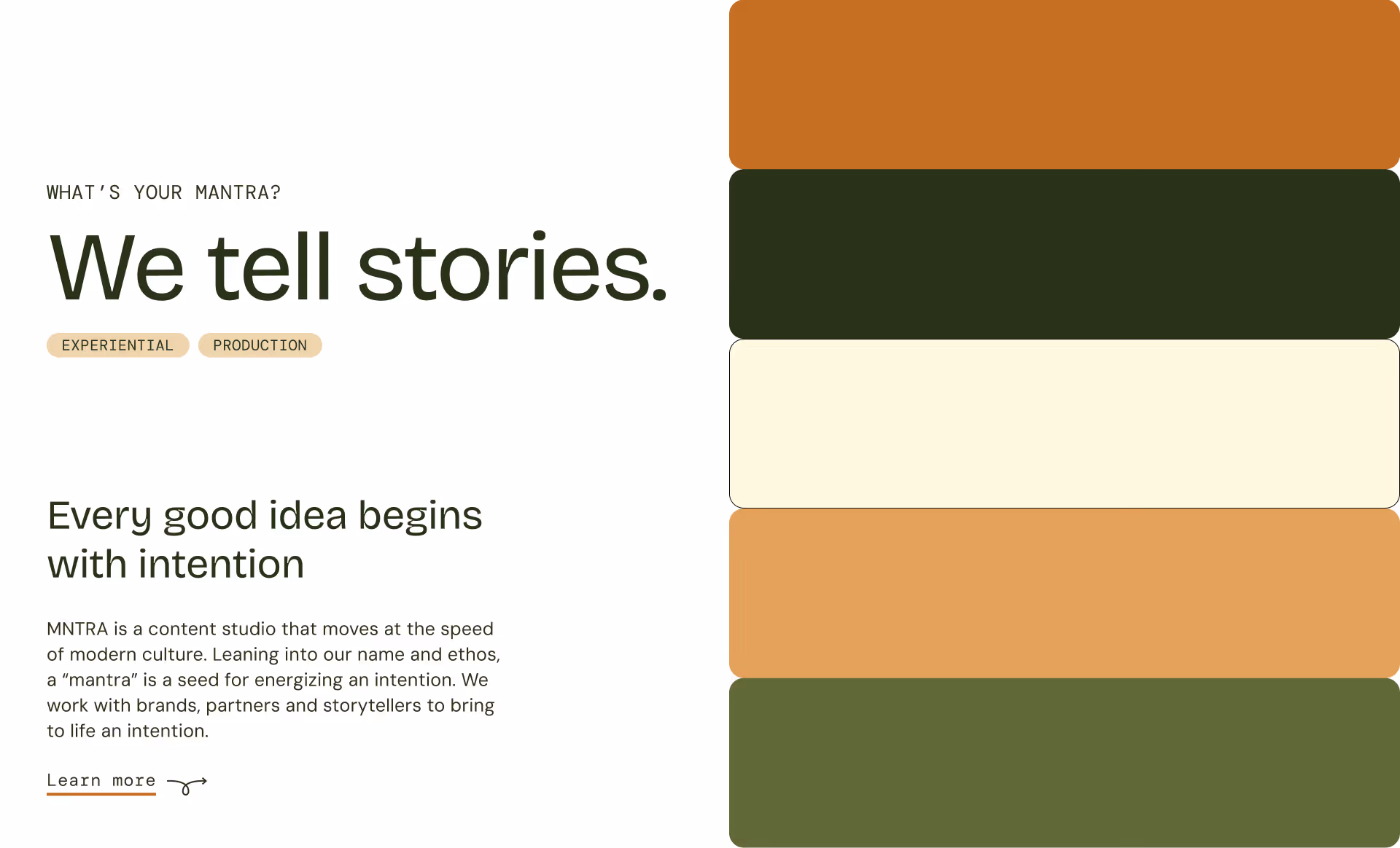
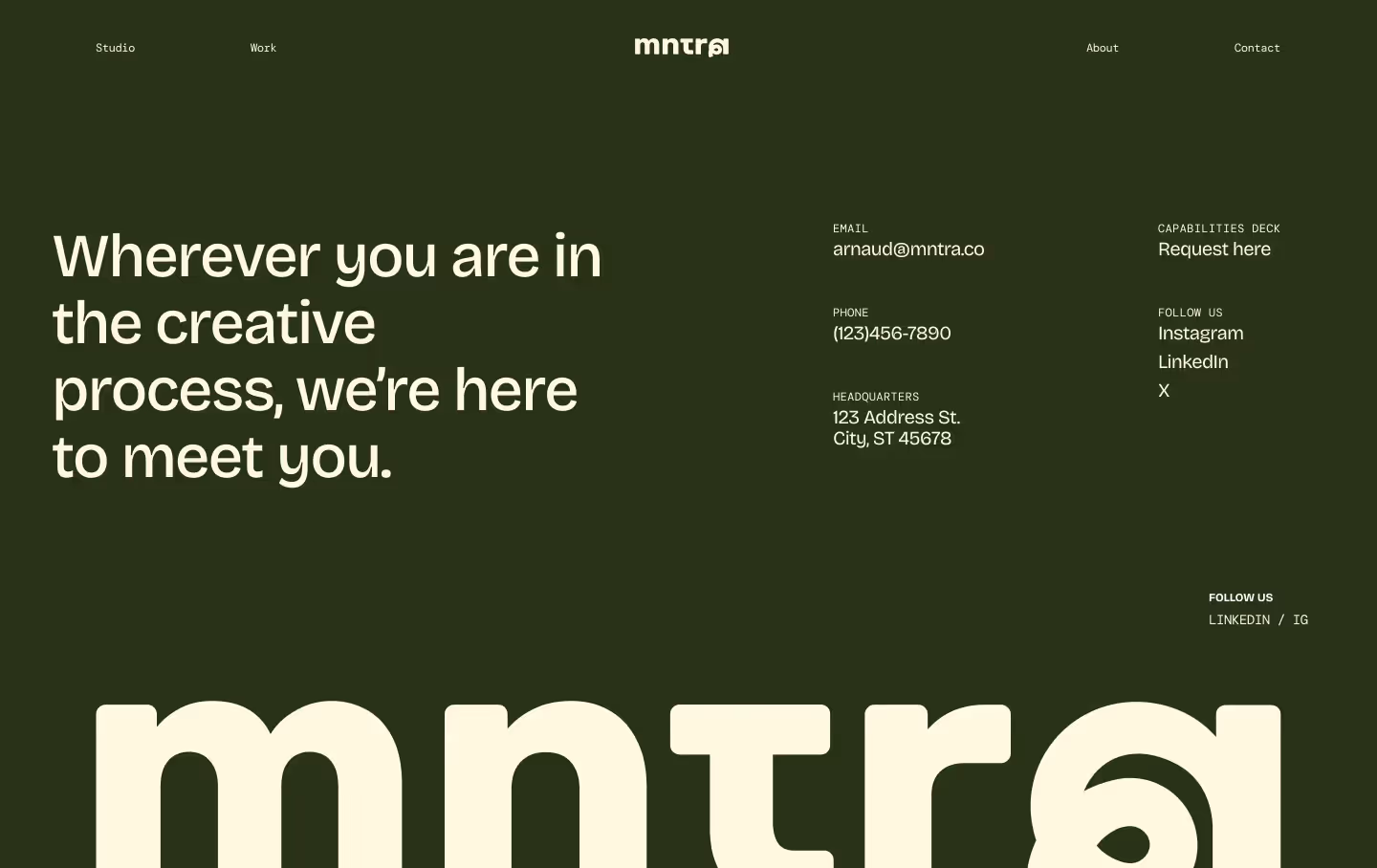
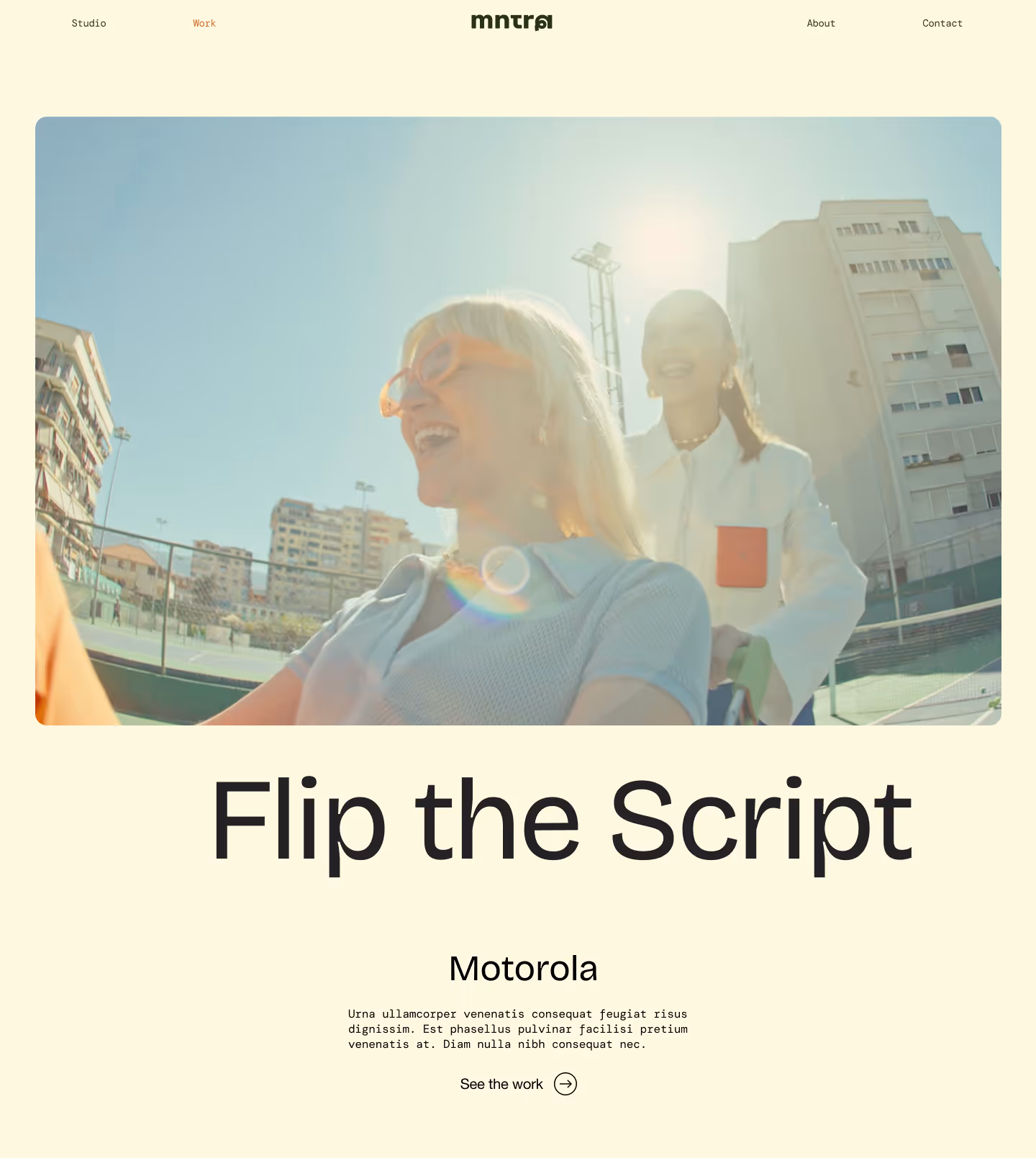
02website
motion with intention
The website contains many moments of interactivity, animation, and surprise, without feeling overwhelming. The balance and subtlety of the site echo the ethos of the brand.
04collateral
.avif)
.avif)